In the past, Sanjay showed how to create several basic graphs using both R and SAS ODS Graphics code. I'm going to take a bit of a "deeper dive" and focus a series of blog posts on highly customized graphs. Hopefully the code for these customizations will provide you with insights into how to take the things you might be doing in R, and learn how to do them in SAS.
In this example, I'll be graphing temperature data for three cities, and overlaying a separate line for each city. Below are my two graphs created using R and SAS. And here is a picture of a very cold day from my old college buddy Brian, to get you into the proper mindset for plotting temperature data!

R Graph, created using ggplot():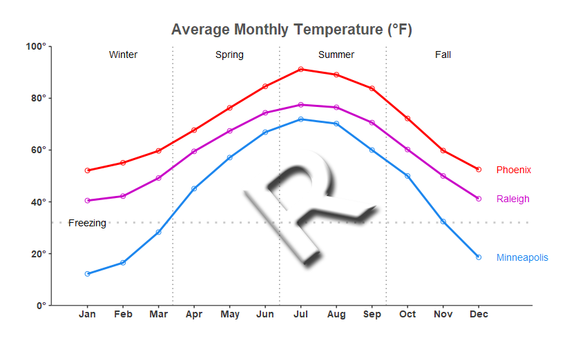 SAS Graph, created using Proc SGplot:

My Approach
I will be showing both the R code (in blue) and the SAS code (in red) used to create both of the graphs above. There's a lot of code here, therefore you might want to just skim it, and look for sections that interest you (rather than trying to read and digest the whole thing top-to-bottom). Make a mental note of what's covered in this example, so you can refer back to it when you're converting your similar R graphs to SAS in the future. You might even make use of your browser's string search (such as Ctrl+f) to look for specific commands or topics.
Note that there are many different ways to accomplish the same things, in both R and SAS - and keep in mind that the code I wrote here isn't the only (and not necessarily even the 'best') way to do things. Also, the code below is sometimes not presented in the same order I ran it in to create the graphs (so you won't be able to simply copy-n-paste it and run it). I include links to the full R and SAS programs at the bottom of the blog post, that you can download and run.
The Data
Both R and SAS can read data from an external file, but I thought it would be useful to demonstrate how to encode data into the code itself. This can be very useful, because you don't have to worry about your data file disappearing - if you've got the code, you've got the data!
Here is the R code to create the data:
my_data<-read.table(header=TRUE,text="
month temp city
1 52.1 Phoenix
1 40.5 Raleigh
1 12.2 Minneapolis
2 55.1 Phoenix
[lines omitted for brevity]
11 32.4 Minneapolis
12 52.5 Phoenix
12 41.2 Raleigh
12 18.6 Minneapolis
")
And here is the SAS code to create the data:
data my_data;
length city $12;
input month temp city $;
datalines;
1 52.1 Phoenix
1 40.5 Raleigh
1 12.2 Minneapolis
2 55.1 Phoenix
[lines omitted for brevity]
11 32.4 Minneapolis
12 52.5 Phoenix
12 41.2 Raleigh
12 18.6 Minneapolis
;
run;
Preparing to Graph:
In R, I had to install several packages, and then in my R jobs I have to add a library() line to use those packages. None of this code actually draws the graph ... we're just fixin' to draw the graph (that's a popular expression in the southeast U.S.). Here's the R code I used:
# get access to the ggplot2 stuff
#install.packages("ggplot2")
library(ggplot2)
# needed to save html version with mouseover text
#install.packages("plotly")
library(plotly)
# needed, to use label_number() on y-axis degree values
#install.packages("scales")
library(scales)
# needed for antialiasing (triggered by type="cairo" in ggsave)
#install.packages("Cairo")
library(Cairo)
SAS ODS Graphics procedures and tools are all included by default in Base SAS, therefore there's nothing extra you have to do.
/* You don't need to do anything to prepare SAS to create graphs */
Plotting the data:
In R, I call ggplot() and tell it the name of my dataset, and the x, y and group variables (each group/city is plotted as a separate line). I use geom_line() to draw the lines, and geom_point() to place the circular markers along the line. And I call theme() to suppress the color legend for the lines.
my_plot <- ggplot(my_data,aes(x=month,y=temp,group=city,color=city,label=city))+
geom_line(size=1) +
geom_point(shape=1,size=2) +
theme(legend.position="none")
In SAS I use the SGplot procedure, with a series statement to draw the line. I use the marker option of the series statement to place markers at the data points along the line. I use the noautolegend option on the sgplot line to suppress the color legend for the lines.
proc sgplot data=my_data noborder noautolegend;
series x=month y=temp / group=city lineattrs=(thickness=5)
markers markerattrs=(symbol=circle size=7pt);
Titles
I used ggtitle() to create the title at the top of the graph in R. I wanted to use the 'degrees' character in the title to show '(°F)', and R lets me do that by specifying a \u and then the Unicode hexadecimal value 00b0.
ggtitle(sprintf('Average Monthly Temperature (\u00b0F)')) +
We use a title statement in SAS. The syntax to specify the degree character is a little more complex - I have to define an escapechar, and then use that escape character in the title to insert {unicode '00b0'x} where I want the degree character.
ods escapechar='^';
title1 height=16pt c=gray33 "Average Monthly Temperatures (^{unicode '00b0'x}F)";
Line Colors
Using default colors is convenient, and usually produces acceptable results ... but I seldom use defaults in my graphs. Here's how you specify the three colors (for the three lines) in R. Notice that the RGB hexadecimal color codes are denoted by the '#' symbol.
scale_color_manual(values=c("#1C86EE","red","#c906c7"))
In SAS, we precede a hexadecimal RGB color codes with 'cx' rather than '#'.
styleattrs datacontrastcolors=(red cxc906c7 cx1C86EE);
Background, Border, and Grid Lines
In R, the default graph has a gray background with white grid lines. I specified theme_bw() to to use a white background with gray grid lines instead. In this particular case, I didn't want grid lines at all, and I only wanted to show the left and bottom axis lines, therefore I used theme() to get rid of the major and minor grid lines, and turn off the border around the graph, and then show the axis line (left and bottom) in dark gray.
theme_bw() +
theme(
panel.grid.major=element_blank(),
panel.grid.minor=element_blank(),
panel.border=element_blank(),
axis.line=element_line(color="gray33"))
The default SAS graph style (htmlblue) has a white background by default, therefore I didn't have to change that (but I go ahead and show the code, for comparison). In SAS, you use the noborder option on the Proc SGplot line to turn off the border around the graph. The axis line on the left and bottom are shown by default - you could use the xaxis display=(noline) option if you want to turn them off. The SAS graph does not show grid lines by default, therefore there's no need to turn them off - if you wanted to turn grid lines on in SAS, you could use code like yaxis grid gridattrs=(pattern=dot color=gray88);
ODS HTML style=htmlblue;
proc sgplot data=my_data noborder;
/* You don't need to do anything - grid lines are not shown by default */
Axis Tick Marks and Labels
Here's the code I used in R to have the y axis tick marks go from 0 to 100 by 20 (for the temperature), and the x axis go from 1 to 12 by 1 (for the 12 months). I wanted the temperature values to all have the degree symbol after them, therefore I used the Unicode 00b0 character as the suffix for those values. I blanked out the overall labels for the x and y axes by specifying a blank value (two quotes, with a space between them). And I used expand to add a little bit of space to the left and right of the min and max values on the x axis.
scale_y_continuous(labels=label_number(suffix ="\u00b0"),
limits=c(0,100),breaks=seq(0,100,by=20),expand=c(0,0)) +
scale_x_continuous(expand=c(.01,.90), breaks=seq(1,12,by=1) +
ylab(" ") +
xlab(" ") +
Here's the code I used in SAS. Note that I had to hard code each of the y axis values, in order to use the Unicode 00b0 degree character (this is a bit more work than in R). I used the offsetmin and offsetmax to add a bit of space to the left and right of the min and max values on the x axis.
yaxis display=(nolabel) values=(0 to 100 by 20)
valuesdisplay=(" " "20^{unicode '00b0'x}" "40^{unicode '00b0'x}"
"60^{unicode '00b0'x}" "80^{unicode '00b0'x}" "100^{unicode '00b0'x}")
valueattrs=(size=11pt weight=bold color=gray33)
offsetmin=0 offsetmax=0;
xaxis display=(nolabel) values=(1 to 12 by 1)
valueattrs=(size=11pt weight=bold color=gray33)
offsetmin=.04 offsetmax=.02;
Reference Lines
Rather than using the default grid lines at the tick marks in R, I add custom reference lines. I add three reference lines along the x axis to visually split up the four seasons, and I add a reference line along the y axis to indicate the freezing temperature. Here's my R code - note that I had to use a separate command for each reference line, and a separate command (annotate) to label the 'Freezing' line.
geom_vline(xintercept=3.4,color="gray55",linetype="dotted") +
geom_vline(xintercept=6.4,color="gray55",linetype="dotted") +
geom_vline(xintercept=9.4,color="gray55",linetype="dotted") +
geom_hline(yintercept=32,color="gray80",size=1,linetype="dotted") +
annotate(geom="text",label="Freezing",x=1,y=32,size=3.5) +
Here's the code I used in SAS. Note that SAS lets me specify multiple refline values in one statement. Labeling reflines is a bit easier and more flexible in SAS - I get to specify the 'Freezing' label directly in the refline statement, and I can easily position it outside the axis (By comparison, I couldn't figure out how to annotate the Freezing label outside the axis in R ... perhaps someone can help me out with that in the comments section!)
refline 3.4 6.4 9.4 / axis=x lineattrs=(color=gray22 pattern=dot);
refline 32 / axis=y lineattrs=(color=gray55 pattern=dot)
label="Freezing" labelloc=outside labelpos=min;
Labeling the Seasons
In R, I use annotate() commands to add the text labels for the seasons. These let me specify everything (such as the text, x/y positions, and justification) as parameters.
annotate(geom="text",vjust=.5,hjust=.5,size=3.5,y=97,x=2,label="Winter") +
annotate(geom="text",vjust=.5,hjust=.5,size=3.5,y=97,x=5,label="Spring") +
annotate(geom="text",vjust=.5,hjust=.5,size=3.5,y=97,x=8,label="Summer") +
annotate(geom="text",vjust=.5,hjust=.5,size=3.5,y=97,x=11,label="Fall") +
In SAS, I create an annotate dataset, and then use that dataset as the sganno= on the Proc SGplot line. The SAS annotation requires a bit more code, but it is much more flexible (allowing you to annotate anywhere on the page, using combinations of many different coordinate systems).
data anno_seasons;
length function x1space y1space anchor $50;
layer="front";
function="text"; textcolor="gray33"; textsize=9;
textweight='bold'; anchor='center';
width=50; widthunit='percent';
x1space='datavalue';
y1space='datavalue';
length label $100;
x1=2; y1=95; label='Winter'; output;
x1=5; y1=95; label='Spring'; output;
x1=8; y1=95; label='Summer'; output;
x1=11; y1=95; label='Fall'; output;
run;
sgplot data=my_data sganno=anno_seasons;
Label each Line
Here's how I got the label at the end of each line. In R, when I specify ggplot(), I define label=city so that I can use it later via the geom_text(). In geom_text, I tell it to only draw the label text where month==12 (ie, the last/right-most month in each line). I nudge (move) the text to the right a little, so it isn't drawn overlapping the line marker, and I tell it not to show this in the legend. I also use clip="off" to prevent the text from being clipped/truncated if it goes outside the normal area.
my_plot <- ggplot(my_data,aes(x=month,y=temp,group=city,color=city,label=city))+
geom_text(data=subset(my_data,month==12),
position=position_nudge(0.5),hjust=0,size=3.5,show.legend=FALSE) +
coord_cartesian(clip="off") +
Adding labels to lines is a bit easier in SAS - there's a curvelabel option built right into the series (line) statement. And optionally, I tell it to label the line at the 'max' (right-most) end, and place the label outside the axis.
series x=month y=temp / group=city markers curvelabel curvelabelpos=max curvelabelloc=outside;
Printing Month Numbers as Text
The months are numeric in the data (1-12), but I want them to show up as the 3-character text month names in the graph. I don't know of a slick way to do that in R (if you know of a way, please let me know in the comments!). Therefore I had to hard-code them when I declared the x axis.
scale_x_continuous(expand=c(.01,.90), breaks=seq(1,12,by=1),
labels=c('Jan','Feb','Mar','Apr','May','Jun','Jul','Aug','Sep','Oct','Nov','Dec')) +
I could have similarly hard-coded the values along the axis in SAS, but SAS provides a much slicker way to handle this. We can create a custom format in SAS, that prints the numeric values as the desired character values. First I use Proc Format to create the custom format (which I call mmm_fmt), and then in my Proc SGplot I use a format statement to tell it to print the numeric month values with that format.
proc format;
value mmm_fmt
1='Jan'
2='Feb'
3='Mar'
4='Apr'
5='May'
6='Jun'
7='Jul'
8='Aug'
9='Sep'
10='Oct'
11='Nov'
12='Dec'
;
run;
proc sgplot data=my_data;
format month mmm_fmt.;
Mouseover Text
Adding mouseover text for the plot markers (aka, tooltips) requires several steps in R. When I first tried it, I was getting the same variable in the mouseover text multiple times (because I was using them for both lines and markers), therefore I had to specify custom text in the geom_point()'s aes(). I then used ggplotly to create html output (which contains the mouseover text), and wrote it out to a file using save_html().
geom_point(shape=1,size=2,
aes(text=paste("City: ",city,"<br>Month: ",month,"<br>Temp: ",temp))) +
my_plot1 <- plotly::ggplotly(my_plot,width=850,height=500,tooltip="text") %>% layout(autosize=FALSE)
htmltools::save_html(my_plot2,paste(name,".htm",sep=""),background="white",libdir="shared_lib")
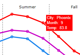
"But wait! - There's more!..." You might have noticed that I specified a libdir in the code above - this is the name of the folder where R writes out a bunch of stuff (mainly javascript) that it needs in order to implement the mouseover text. Note that this is 4.2MB of "extra stuff" you'll need to store along with your graph's html page. (What if sometime later, you move the .htm file but forget to move the libdir? What if the javascript implementation changes, and breaks some of the functionality? Things to think about!)
find shared_lib -type f -print
shared_lib/htmlwidgets-1.5.3/htmlwidgets.js
shared_lib/plotly-binding-4.9.3/plotly.js
shared_lib/typedarray-0.1/typedarray.min.js
shared_lib/jquery-3.5.1/jquery-AUTHORS.txt
shared_lib/jquery-3.5.1/jquery.js
shared_lib/jquery-3.5.1/jquery.min.js
shared_lib/jquery-3.5.1/jquery.min.map
shared_lib/crosstalk-1.1.1/css/crosstalk.css
shared_lib/crosstalk-1.1.1/js/crosstalk.js
shared_lib/crosstalk-1.1.1/js/crosstalk.js.map
shared_lib/crosstalk-1.1.1/js/crosstalk.min.js
shared_lib/crosstalk-1.1.1/js/crosstalk.min.js.map
shared_lib/plotly-htmlwidgets-css-1.57.1/plotly-htmlwidgets.css
shared_lib/plotly-main-1.57.1/plotly-latest.min.js
du -h shared_lib
44K shared_lib/htmlwidgets-1.5.3
44K shared_lib/plotly-binding-4.9.3
32K shared_lib/typedarray-0.1
540K shared_lib/jquery-3.5.1
8.0K shared_lib/crosstalk-1.1.1/css
192K shared_lib/crosstalk-1.1.1/js
204K shared_lib/crosstalk-1.1.1
8.0K shared_lib/plotly-htmlwidgets-css-1.57.1
3.4M shared_lib/plotly-main-1.57.1
4.2M shared_lib
In SAS, all you have to do to turn on mouseover text is specify the imagemap option on the ods graphics statement. And then you can control how the values are displayed by using format and label statements. SAS uses HTML ALT tags to store the mouseover information, therefore no need to drag along 4.2MB of javascript.
ods graphics / imagemap;
proc sgplot data=my_data;
format month mmm_fmt.;
format temp comma5.1;
label city='City' month='Month' temp='Temp.';
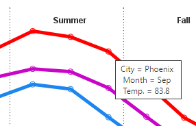
Note that the custom mmm_format I specify in the code above, is applied to the month values printed along the axis, and also the month values shown in the mouseover text (whereas the numeric month values are shown in the R mouseover text). Although it doesn't show up in the screen capture, there was a mouse pointer pointing at the marker that the mouseover text is for.
PNG Image
We had to create the HTML version of the graph (described above) to get an R graph with mouseover text ... but that doesn't create a PNG file. I like having a PNG file, because it is convenient to insert into blogs, emails, social media pages, etc. If we want mouseover text and a PNG image of the graph, I have to create two versions of the output (if there's a way to do both, with just one version of R output, let me know in the comments!) I also installed the optional Cairo package, and used type="cairo" so the lines in the graph will be smooth/antialiased. Note that although the city labels look good in the PNG version (shown above), they're in slightly different positions in the HTML version of the output (just something to keep in mind, when outputting multiple versions!).
Here's the command I ran to get the PNG output:
ggsave(filename="city_temperature_r.png",device="png",type="cairo",
plot=my_plot,dpi=100,height=5,width=8.5,units="in")
In SAS, PNG is the default output for graphs. A PNG file is created, and an HTML file that displays the PNG. (And the mouseover text is simple HTML alt tags, which are included in the HTML file - no special/extra version of the output required.) SAS graphs automatically do antialiasing, therefore no need to specify an option to get that feature. Although PNG is the default, I like to specify it in the SAS program, so there's no uncertainty:
ods graphics / imagefmt=png imagename="city_temperature_r.png"
width=800px height=500px border;
Labeling Browser Tab
I haven't found a way to label the browser tab in the R ggplot() graph output yet. (If anyone knows of a way, let me know in the comments!)
# no way to specify browser tab label for R ggplot()
In SAS, you can specify a title on the ods html statement, and it is used as the label in the browser tab. This isn't a requirement, but it certainly makes it easier to keep track of your graphs!
ODS HTML (title="Phoenix, Raleigh, Minneapolis temperature");
Running the Code
Most modern software provides an interactive development environment (IDE), that lets you easily edit and submit code, and view the output. But I'm old school - I like to write my jobs in a text file using the vi editor, and run them in batch mode from the command line. This way, I know that the code in my file is the exact code needed to produce the graph that is output. Whereas if I was using an IDE, I might have run some code earlier in the session that is affecting the graph I'm currently working on ... or the IDE might be setting some options for me that I'm not aware of ... and if someone else tries to run code I saved from my IDE, their IDE might not be setting the same options, and they won't get the same graph.
I'm not saying you have to do it this way - but I'm saying this works well for me. 🙂
R Studio is the IDE for R - I did install it, and used it to install the optional packages (ggplot2, plotly, scales, and Cairo). But for running my R jobs, I do that from a DOS prompt command line, using the rscript program (see below). Be sure to use rscript rather than r, because r will put you into command-line interactive mode. I write the output to the current directory, and I make sure that is a location I can view using a web browser (to view the output).
rscript city_temperature_r.r
In SAS, the Display Management System (DMS) is the older traditional IDE. The newer, more recent SAS IDE is SAS Studio. But I use the Unix vi editor to write my code, and submit it from a DOS prompt command line, using sas.exe, and view my output in a web browser.
sas city_temperature_sas.sas
My Code
Here is a link to my complete R program that produced the graph.
Here is a link to my complete SAS program that produced the graph.
If you have any comments, suggestions, corrections, or observations - I'd be happy to hear them in the comments section!

10 Comments
Hi Robert, since I'm lazy I think I would have tried to use a block statement to get the seasons in the plot. I have not tried but would not that work, and you do not have to bother about annotation?
I also still see that you are "lazy" and use Jan-Mar as winter instead of dec to feb. It would be interesting to work a bit with showing this logically as we get away from the fiscal year to a season year.
Yep - that's another valid way to do it! 🙂
Per the seasons - I'm using the celestial seasons (the first day of spring is at the spring equinox, which is around March 20). In the graph, I assume the x-values for my monthly data points are in the middle of the month, and I then interpolated where the dividing line for the seasons should be.
A debt of gratitude is in order for sharing data...
Very interesting, thanks. In the R scale_x_continuous line you can replace the c('Jan', 'Feb', 'Mar', ..., 'Dec') vector with the built-in constant month.abb
Thanks for the R tip! ... specifically, using labels=month.abb, rather than hard-coding labels=c('Jan','Feb','Mar','Apr','May','Jun','Jul','Aug','Sep','Oct','Nov','Dec')
You can specify multiple reference lines in one statement in R:
geom_vline(xintercept=c(3.4, 6.4, 9.4),color="gray55",linetype="dotted")
And thanks for another R tip! (I tried it, and it worked well.)
That's an impressive amount of detail. Thanks. There's just one point for us SAS customers outside the USA: what's Fahrenheit? We never use it. To avoid confusion it would be good to label the vertical axis (it always is). Those in the southern hemisphere will have a different view of the seasons too.
Hmm ... I have °F in the title ... but I guess I could repeat that in the y-axis (I try to keep repeated text to a minimum in graphs though).